Objective:
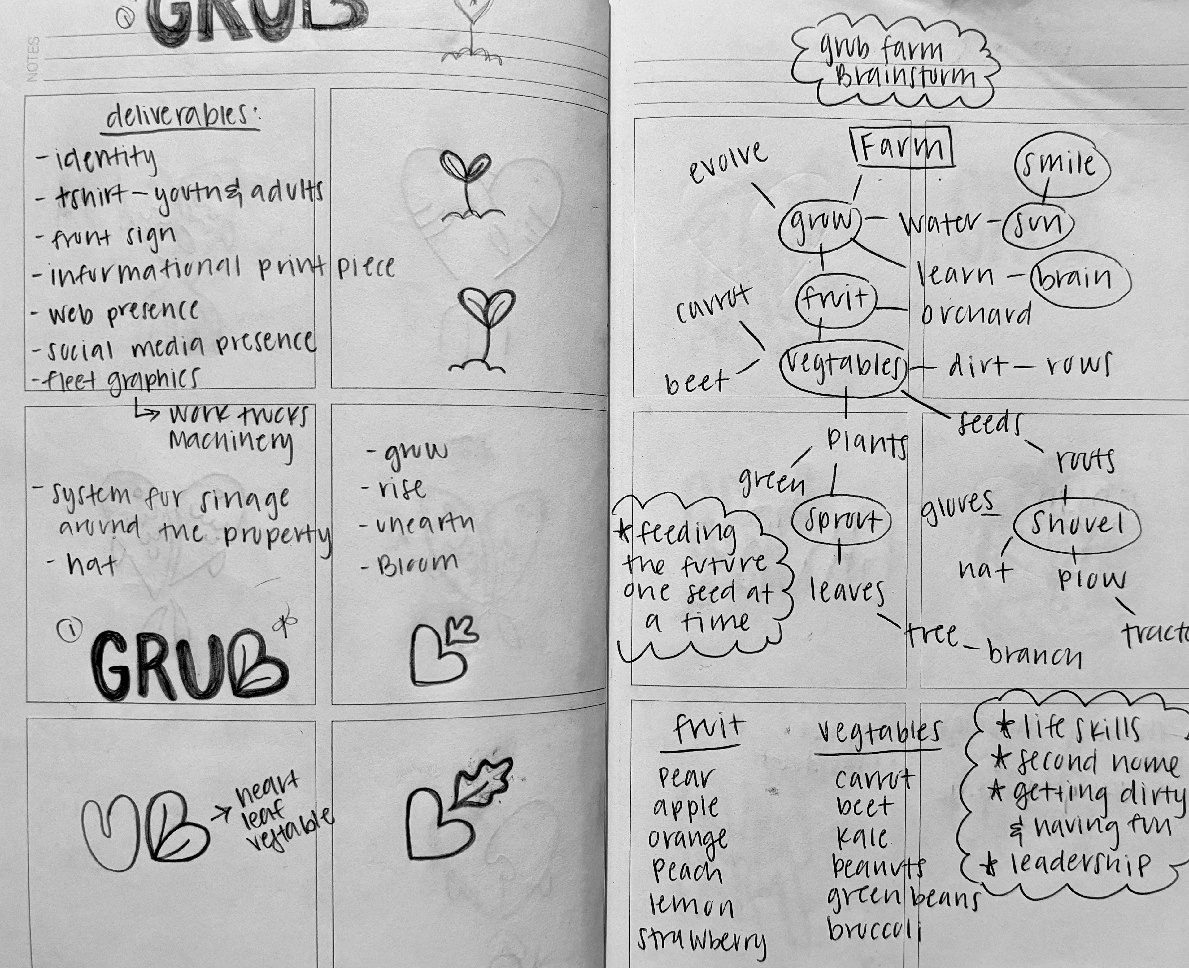
The objective of this project was to create a proposed redesign for the G.R.U.B Farm in Lubbock Texas. G.R.U.B Farm is a youth program of the South Plains Food Bank that works with teens between the ages of 14-18 from diverse backgrounds within Lubbock to help them gain valuable life skills through harvesting and gardening fruits and vegetables. This project involved a team of three student designers. My role involved creating the concept of the proposed logo, illustrating icons, and designing merchandise.
The problem that our team was trying to solve was creating a logo for the G.R.U.B Farm that was easily recognizable, and also matched with their parent company logo which was for the South Plains Food Bank. The target audience for this project was the Lubbock youth community, more specifically children between the ages of 14-18. Our goal was to create a brand identity that captured the essence of the G.R.U.B Farm in a playful yet mature manner, while still maintaining elements from the South Plains Food Bank identity. The G.R.U.B Farm client wanted to highlight the fact that they don't only grow food, but also youths, so our group used this sentiment as inspiration for our designs.
MOOD BOARD
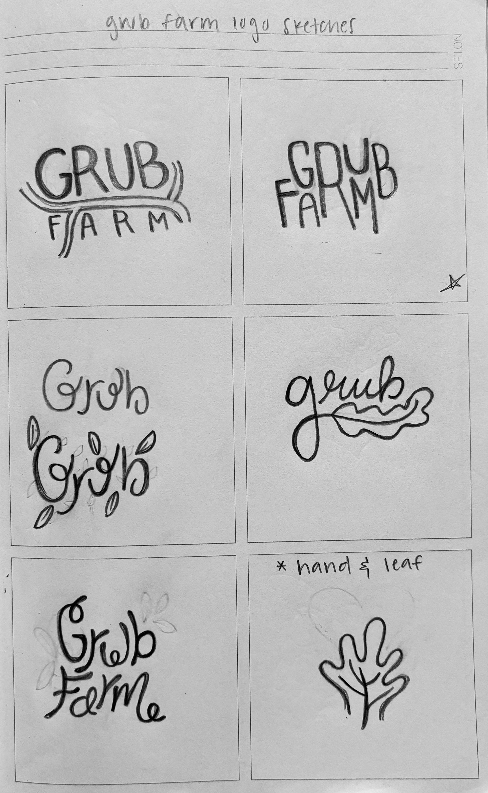
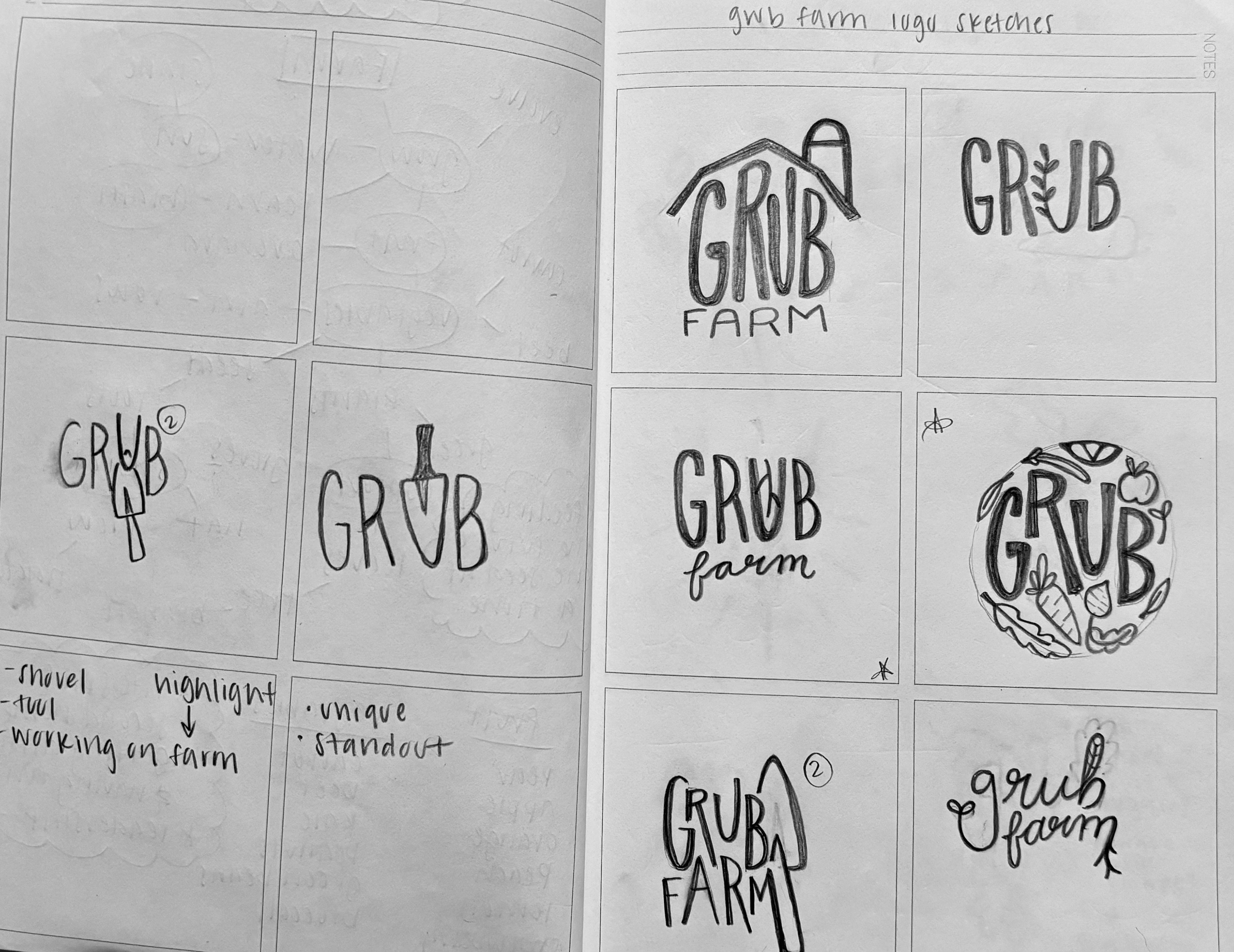
LOGO SKETCHES
Approach:
My group's process for this project was to begin with sketching ideas for the G.R.U.B Farm logo. I began with sketching word marks that combined gardening iconography and the word 'GRUB Farm'. I wanted to subtly incorporate gardening tools or vegetables into the grub farm logo in order to highlight the fact that this company focused on growing fruits and vegetables. However, after many sketches, and meeting with my group, we decided that this approach was too obvious. We collectively decided that we wanted to design a logo that had more of a subtle nod to the gardening aspect. We then came up with the idea of an asterisk that looked like a flower.
When looking for a typeface we found one that had an asterisk that looked exactly like a flower made up of seeds, and this inspired us to create our branding around this icon. To us the asterisk represented that there is more than what meets the eye when it comes to the G.R.U.B Farm. We wanted to use this to highlight the fact that the G.R.U.B Farm was a place to grow vegetables but it’s not just that, they also invest in growing Lubbock youths by teaching them valuable life skills through their gardening. After the identity mark was created we came up with the slogan “growing the future one seed at a time”. This phrase captures the G.R.U.B Farm’s mission while also paying homage to the identity mark in which seeds make up a flower/asterisk.


The final branding included a bright and playful color palette, gardening icons that each incorporate a seed, or petal, from the logo’s icon, and fun characters that represent the children that work at the G.R.U.B Farm. We used these elements to create deliverables for the client in order to show them how our proposed brand identity could be carried throughout their company on their digital platforms and in person at their headquarters.
Conclusion:
This project was my first group project in which we worked with an actual client. I learned a lot about how to communicate effectively with my team and with the client in order to create an impactful identity system. This was a great opportunity for me to exercise voicing my opinions and also to listen to others opinions and incorporate them into my design process. This project also taught me the importance of way-finding signs, and how to create useful elemental deliverables for a clients business. With more time, I would love to create more digital elements such as a flushed out website and social media accounts in order to further expand the company's branding.
